Pupils Vision Therapy Logo Redesign & Stationary
Company: Pupils Vision Therapy
In January of 2020 we were given a class assignment; we were tasked to redesign a company's logo. From there we drew sketches, choose colours that represented the brand, created mockups, and from there presented the logo to the client.
I decided to go with Pupils Vision Therapy - they are a vision therapy provider located in Ottawa, Ontario. Vision Therapy is physical therapy for the eyes and brain. It is a highly effective non-surgical treatment for many visual problems that can interfere with reading. Since this is a professional business the company needed a logo update.

Sketches and Concepts
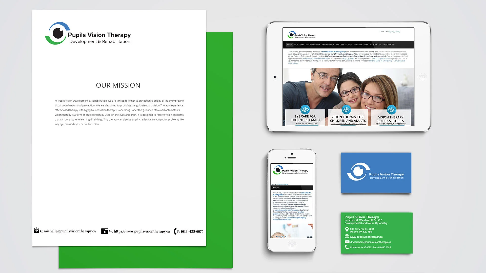
Final Version

About the new logo:
"The new logo was created with the best interests of Pupils Vision Therapy in mind. It is created with both a green and blue swoosh to create the outer circle of the eye and within the centre is the pupil. Alongside the eye is the word mark which works harmoniously with the logo. This logo has a more modern feel moving forward compared to the previous logo."
