Maisie Mudworks – Brand Identity Design
Maisie Mudworks is a small-batch pottery studio that celebrates the artistry of handmade ceramics. The goal of this brand identity was to capture the tactile, grounded, and human essence of the craft — translating the connection between maker and material into a timeless visual form.

Design Approach
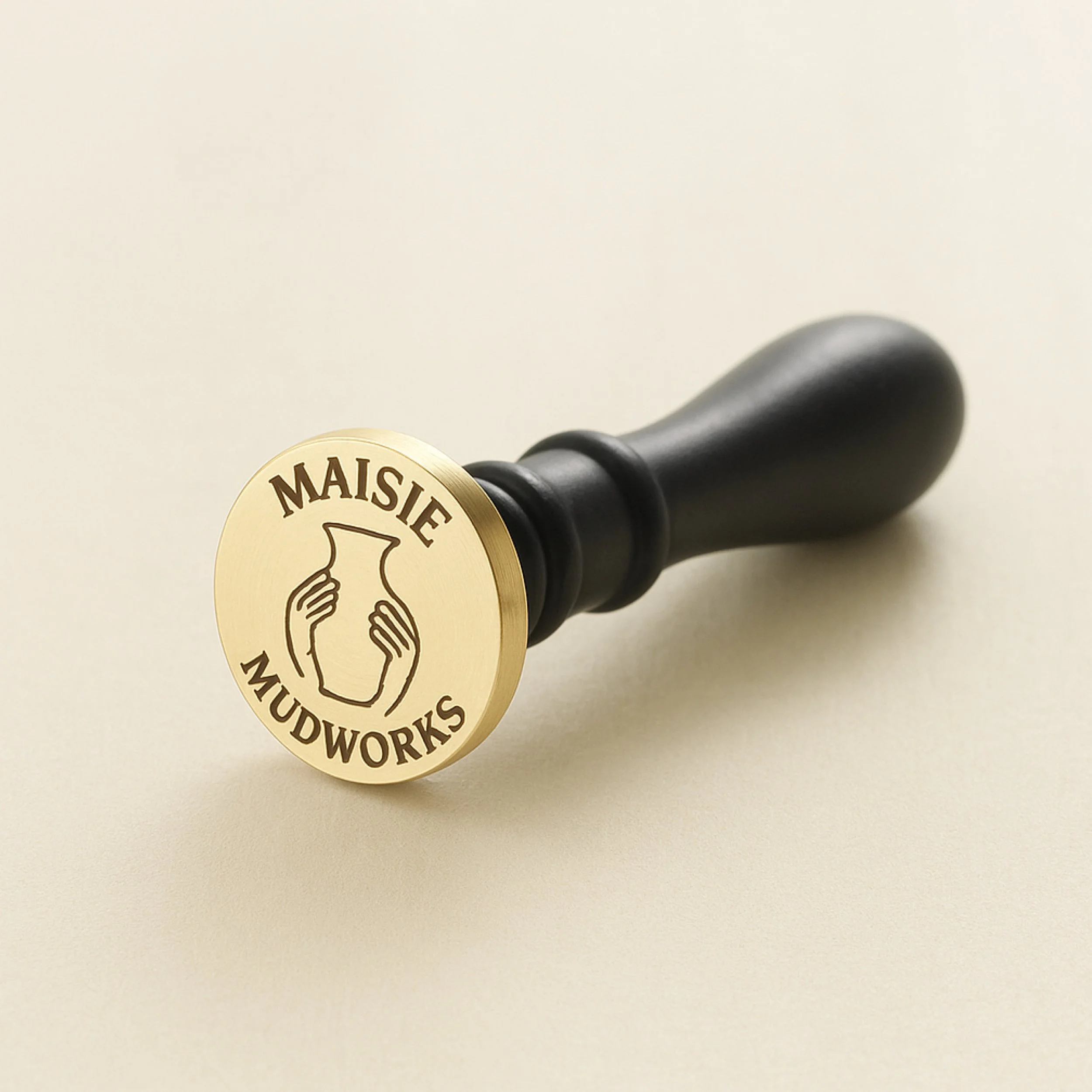
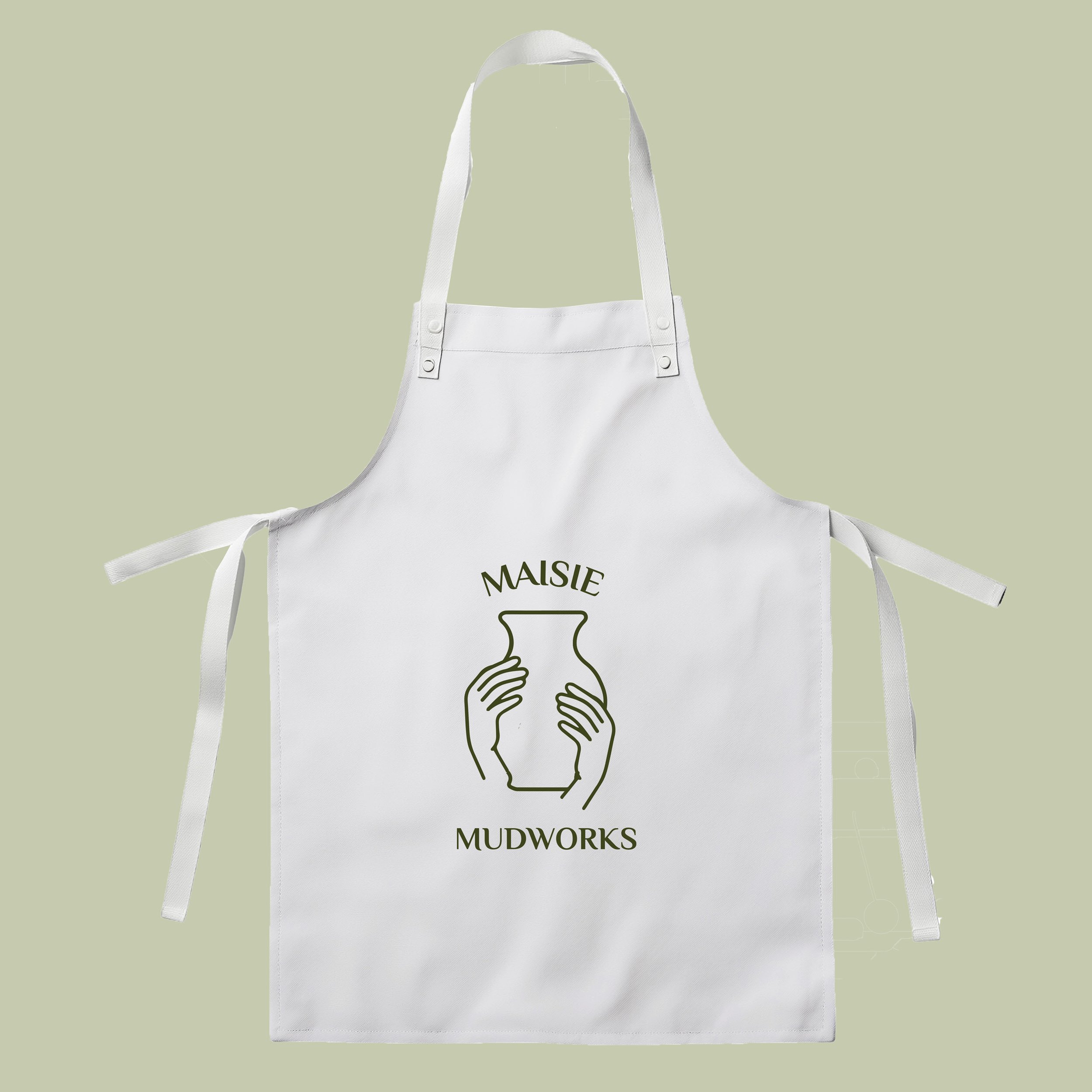
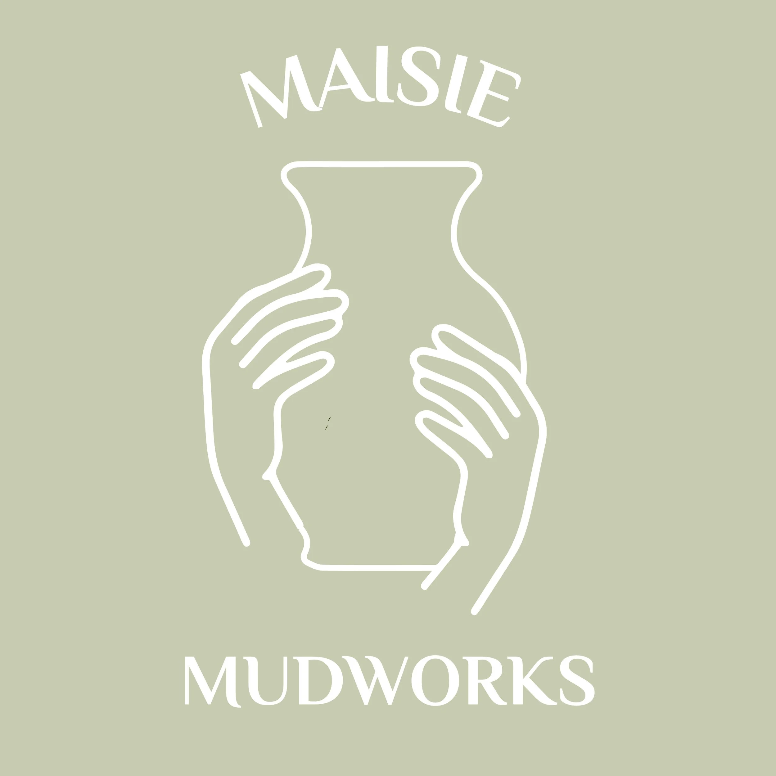
The logo features a pair of hands shaping a clay vessel, symbolizing creativity, care, and craftsmanship. This simple yet expressive illustration communicates the hands-on process at the heart of the brand. Two complementary versions were developed: a minimal monoline design for versatile applications such as stamping, embossing, and packaging; and a full-color version that introduces warm terracotta and earthy olive tones to evoke natural materials and organic textures.

Typography & Color
The logotype uses a soft, organic serif typeface that echoes the flow and imperfection of handmade work. The earthy olive green palette grounds the identity in nature, while the addition of clay-inspired tones in the colored version brings warmth and approachability.
The final identity system reflects the soul of
Maisie Mudworks — authentic, artistic, and deeply connected to the process of creation. It balances simplicity with expressiveness, making it adaptable across digital, print, and physical branding applications.