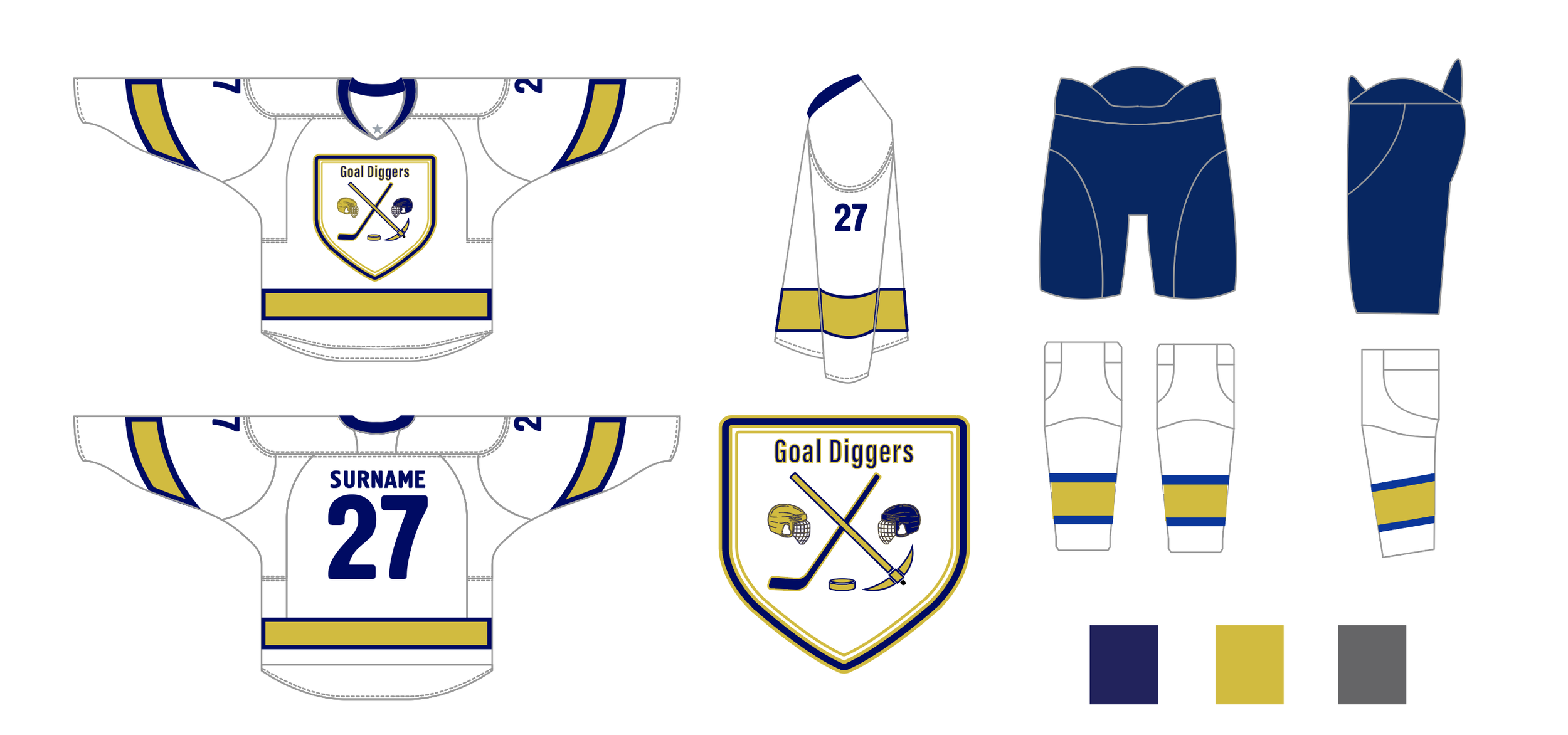
Goal Diggers Team Jersey Design
Concept Overview: The "Goal Diggers" logo embodies the dynamic and fierce spirit of beer league hockey. It combines elements of power and athletic intensity, designed to capture both the energy of the game and the resilience of the team.

Design Elements:
Iconography:
The logo features two helmets facing each other, symbolizing competition and teamwork in the game of hockey. Between the two helmets, there is a hockey stick and a gold pick crossed over each other.
The hockey stick signifies the sport of hockey, while the gold pick symbolizes determination, resilience, and the team's pursuit of success - akin to miners digging for gold. The combination of these elements represents the team's commitment to hard work, skill, and strategic gameplay.
In the centre of the logo, there is a puck, the essential element of the game, emphasizing speed, precision, and scoring goals. The puck is positioned prominently, drawing attention to the fast-paced and dynamic nature of hockey.
Color Palette:
The color scheme of the logo includes dark grey tones, adding a sense of sophistication and strength to the design. The dark blue reflects the cold, crisp nature of the sport. Finally, the use of gold for the pick symbolizes achievement, victory, and the pursuit of excellence on and off the ice.
Overall, the logo conveys a sense of unity, determination, and sportsmanship, all of which reflects the team's competitive spirit and unwavering dedication to success in the game of hockey. It is a powerful emblem to inspire players and fans alike, representing the team's identity and values with pride.